What Is It About Your Room Color And Mood?
Scientists are still trying to work out exactly what the correlation is between room colors and moods, while they have yet to precisely put their finger on the link they confirm that it clearly exists. Follow this article to find out some facts that you didn’t know. When it comes to decorating your rooms, the choice of color can influence your family to be happy and relaxed or on the other hand, be stressed and irritated. Let’s explore why.
Still working and studying
As mentioned above, scientists have not managed to completely understand the link between color and mood, but what they all agree on is there is a definite link because color does affect mood. Taking a good example you could look at pictures of some of the most popular pubs in Dublin in the Irish Republic, take note of the dark wall colors, rich reds or warm yellows, the whole effect is one of warmth, relaxation and a hospitable atmosphere that encourages the visitor to stay on maybe for an extra pint of beer as the ambience is warming.
So the colors that you choose for your rooms will directly affect how people act, think and even feel when in them. Armed with this information, think about this very carefully considering the room’s color scheme as this gives the room its personality.
How do we talk about color moods?
How could room colors influence mood? Do you recall people saying that they are “green with envy” or even “feeling blue”? You may be unconvinced that colors affect people’s moods, but the hard evidence is that colors do affect attitudes, so now you need get some good advice about how to choose the colors for your room that respond to your personality, objectives and the perceived climate you wish to achieve.
The personality of dominant color
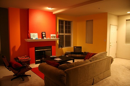
Here is a good example based on primary colors, you may decide to paint a wall in your room using a primary color for example red, red is a primary and therefore a dominant color it gives off a completely different mood feeling from pink which is a derivative. Red exudes a hard aggressive vibe whereas pink is a color that manages to reduce aggressive behavior. In the same way green colored walls make many people think of government offices or hospital wards in a generally negative way, whereas a pastel shade of light green makes many people think of green spaces, light and freshness and leads people to feel more positive and at peace with themselves.
Mixing warm and cool colors
When you are thinking about which color scheme to choose for your rooms it is important to keep in mind that a balanced color scheme can best be achieved with a combination of warm and cool colors. You can get a good idea of what colors sit on the scale on warm and cool colors if you just go to visit a paint shop supplier and ask to see a color wheel warm colors sit on one side of the wheel while the cooler colors sit on the other side of it.
You will see that warm colors that have appealing undertones are various shades of orange and yellows, reds and yellow- green combinations. The colors radiate warmth and a feeling of homeliness. If you do decide to use these colors to paint your rooms you should bear in mind that the colors advance the walls and make small rooms seem smaller while making large rooms seem more intimate and friendly.
Cool colors offset warm colors
Going back to the color wheel, you can see that cool colors including blues, blue greens and purples contain cool undertones and have the opposite effect of warm colors. These colors are naturally soothing and have a calming effect on the people who experience them. In the same way that warm colors reduce the apparent dimensions of room, cool colors make a room appear larger while at the same time making the room appear to be cooler. For this reason, cooler colors are recommended for rooms that can enjoy plenty of sunshine while they don’t work so well in rooms that don’t have the benefit of much natural light.
Should you consider decorating using neutral colors?
Neutral colors are sometimes called non colors and they are black, grey or white, neutral colors can be combined with primary colors effectively if your design for decoration is carefully planned. Using the colors described above you can create a warm or a cool mood depending on your room’s position and the function of the room in question. For example, a kitchen lends itself really well to combining neutral colors and cooler colors as the kitchen appears to be bright and spacious. On the other hand, an intimate bedroom or a living room can benefit with a mix of neutral and warm colors to look welcoming and even cozy.
If you need help to choose the paint colors for your house to produce different moods, we are more than willing to help. As one of the best residential painters in Toronto, we can certainly help you select outstanding paint colors and complete the painting job quickly with the best results.